

Fine-Art Nature Print Buyer’s Guide
The Fine-Art Nature Print Buyer’s Guide: Choose, Display & Care
Bring the wild home with confidence—learn how to pick the best medium, size, framing, and light so your art looks extraordinary for decades.
New to fine-art prints or upgrading a space? Start here, then explore the Wildlife Gallery and Landscape Gallery.
Choose Your Print Medium
Pick the medium that matches your light, viewing distance, and room mood. Not sure which to choose? See the quick guides for Metal, Canvas, and Giclée Paper, or dive deeper in the Fine-Art Print Knowledge hub.
Archival Paper (Giclée)
Look: Soft, nuanced tones; museum feel with mat + frame.
Best for: Living rooms, bedrooms, libraries—timeless, elegant spaces.
Pros: Highest tonal subtlety; flexible framing options.
Consider: Requires glazing (UV acrylic or glass); avoid persistent direct sun.
Learn more: What is a Giclée Print?
Canvas Gallery Wrap
Look: Textured, matte surface; frameless or float-framed.
Best for: Large walls, airy rooms; minimizes reflections.
Pros: Lightweight; glare-forgiving; relaxed, modern vibe.
Consider: Slightly less micro-detail than paper or metal.
Learn more: What Are Canvas Prints?
Metal (Aluminum Dye-Sub)
Look: High pop; glossy or matte finish; modern depth.
Best for: Kitchens, hallways, contemporary spaces; easy to clean.
Pros: Durable, moisture-resistant, vibrant.
Consider: Gloss can reflect—choose matte for bright rooms.
Learn more: What Are Metal Prints?
Paper (Giclée): Highest tonal subtlety and classic framing options.

Canvas: Matte, glare-forgiving texture—great for large, airy spaces.
Metal: Vivid and durable—choose matte metal to reduce reflections in bright rooms.
Pick the Right Size (and Aspect Ratio)
Match the art to the wall, furniture, and viewing distance. As a quick rule, artwork above a sofa or bed should be 60–75% of the furniture width, with the bottom edge roughly 6–10 in above the back. For more detail, see What Print Size Should I Choose? and Triptych & Polytch Wall Art.
| Wall Width | Suggested Print Size | Common Ratios |
|---|---|---|
| 48–60 in (122–152 cm) | 24×36 in / 30×40 in | 2:3 (camera-native), 3:4 |
| 60–84 in (152–213 cm) | 30×45 in / 40×60 in | 2:3 panoramic feel |
| Entryways & niches | 16×24 in / 20×30 in (vertical) | 2:3 or 4:5 classic |
| Triptych (3 panels) | Three 20×30 in or 24×36 in | Keep 1.5–2 in gaps between panels |
Tip: If the photograph was composed in a native ratio (e.g., 2:3), keep that ratio for integrity—heavy cropping can change the story of the image. For multi-panel layouts, preview spacing on the wall with painter’s tape before ordering.

2:3 Landscape — a versatile ratio for 30×45 in and 40×60 in statement pieces.
Go big for immersion—choose a size that’s ~60–75% of the furniture width beneath it.
Vertical formats excel in hallways and entryways—try 16×24 in or 20×30 in.
Framing & Mounting That Elevate the Image
The right presentation turns a great print into a showpiece. Choose mounting that fits the room’s light, style, and scale—and keep the focus on the art. For a deeper dive, see Framed Wall Art and What Are Exhibit Mounts?
Paper Prints (Giclée) — Mat & Frame
- Look: Soft tonal gradations; museum aesthetic with a mat and simple frame.
- Mat width: Typically 2.5–4 in (larger pieces can carry 4–5 in).
- Frames: Black, white, natural oak, or walnut complement most interiors.
- Glazing: Use UV-protective acrylic (lighter, safer) or low-reflection/AR acrylic to cut glare.
- Spacing: Consider hidden spacers so glazing never touches the print surface.
Guide: Framed Wall Art
Canvas Gallery Wrap — Float Frame
- Look: Matte, textured surface that minimizes reflections and feels organic.
- Mount: Ready-to-hang gallery wrap; upgrade with a float frame for a shadow reveal.
- Reveal gap: Aim for a clean 0.25–0.5 in uniform gap between canvas and frame.
- Style: Works beautifully large; easy on bright rooms and open-plan spaces.
Primer: What Are Canvas Prints?
Metal (Aluminum Dye-Sub) — Inset Frame & Cleat
- Look: Vivid, modern presence; choose matte for bright rooms to reduce reflections.
- Mount: Inset frame on back with a French cleat; the front remains frameless and floats off the wall.
- Depth: Typical standoff is ¾–1¼ in for a clean gallery float.
- Use cases: Kitchens, hallways, and contemporary spaces; easy to clean.
Compare finishes: What Are Metal Prints?
Bonus: Exhibit Mounts
- Why: Sleek, durable presentation for offices, lobbies, and high-traffic spaces.
- Look: Clean edges and a flush, modern profile that emphasizes the image.
Details: What Are Exhibit Mounts?
Pro tip: If you have bright windows, angle art lights at ~30° and prefer matte finishes (canvas or matte metal) or AR acrylic for paper prints. In moisture-prone rooms, metal is usually the safest choice.
Paper + Mat + Frame — museum feel with UV/AR acrylic.

Canvas + Float Frame — matte texture and elegant shadow gap.
Metal + Inset Frame — frameless, durable, and easy to hang via cleat.
Light It Like a Gallery
The right lighting makes color, texture, and depth come alive. Use the simple guidelines below to reduce glare, boost color accuracy, and give your print a clean, gallery-quality presence. For deeper specs and mounting tips, visit the Fine-Art Print Knowledge hub and Framed Wall Art.
Essential Settings
- Aim angle: ~30° to the art to minimize reflections. Adjust ±5–10° if you see hotspots.
- Color quality (CRI): Choose CRI ≥ 90 (CRI 95+ for the most faithful color.
- Color temperature (CCT): Neutral-warm 3000–3500 K flatters most nature scenes; use 4000 K for a cooler, modern feel.
- Beam spread: 15–25° for narrow spot on small pieces; 36–60° floods for large prints or closer fixtures.
- Fixture distance: Track/recessed heads typically 24–36 in from the wall, aimed at the artwork’s center.
- Dimming: Keep it comfortable; brighter by day, softer by night. Aim for even coverage without washing the wall.
Match Light to the Medium
- Metal prints: Choose matte metal for bright rooms to cut glare. If you prefer glossy, lower the angle or dim slightly to avoid reflections. Metal guide.
- Canvas: Matte surface is naturally glare-resistant; a gentle flood beam preserves texture. Canvas guide.
- Archival paper (giclée): Use UV/AR acrylic glazing to reduce reflections and protect the print. Angle lights carefully to avoid catching the glazing. See framing tips.
Pro tips: Keep room bulbs consistent in CCT for harmony. Avoid direct sunlight on paper prints. In moisture-prone spaces (bath/kitchen), metal is often the safest choice.

High-contrast scenes look incredible—just avoid direct glare with a 30° aim and (if needed) matte metal or AR acrylic.
Canvas is naturally glare-resistant—great for open, sunlit spaces.

Choose 3000–3500 K for warm scenes; go cooler (≈4000 K) if your room has a modern, cool palette.
Care & Longevity
A few simple habits keep your artwork vibrant for decades. Follow the medium-specific tips below, then check our Fine-Art Print Knowledge and Return Policy for details.
Best Environment
- Light: Avoid persistent direct sun. Use shades or UV glazing if the wall gets bright daylight.
- Humidity: Keep indoor relative humidity around 30–50%; avoid bathrooms/saunas for paper or canvas.
- Heat: Don’t hang above radiators, fireplaces, or heat vents.
- Hanging: Use two-point hanging with proper wall anchors to keep frames level and secure.
Archival Paper (Giclée) Care
- Glazing: Prefer UV-protective / anti-reflective acrylic to reduce glare and weight.
- Cleaning: Dust the glazing only with a clean microfiber cloth. For smudges, use acrylic-safe cleaner on the cloth (do not spray directly).
- Handling: If unframed, handle edges with cotton gloves; avoid touching the print surface.
- Framing: Use acid-free mat and backing; consider spacers so glazing doesn’t touch the print.
More on framing: Framed Wall Art
Canvas Gallery Wrap Care
- Dusting: Lightly dust with a dry, soft microfiber cloth. No sprays or solvents.
- Placement: Avoid high humidity and grease (kitchens without hoods) to keep texture clean.
- Framing: A float frame adds protection and a clean shadow reveal.
- Tension: If slack appears, a professional framer can re-tension safely.
Canvas basics: What Are Canvas Prints?
Metal (Aluminum Dye-Sub) Care
- Cleaning: Wipe with a slightly damp microfiber cloth; for stubborn spots, use a drop of mild dish soap, then dry immediately.
- Avoid: Abrasive pads, ammonia, vinegar, glass cleaners, or paper towels.
- Where it shines: Higher humidity areas (bath, kitchen) and high-traffic spaces.
- Finish: Choose matte metal to tame reflections in bright rooms.
Learn more: What Are Metal Prints?
Pro tip: Spray cleaners onto your cloth, not directly on glazing or prints. When in doubt, test a tiny corner first. For questions or custom care advice, reach out via the contact page.

In humid spaces, metal is usually the most resilient choice; keep indoor RH near 30–50%.
Paper (Giclée) delivers the most subtle tones—protect with UV/AR acrylic, dust glazing only, avoid sprays on the surface.
Build a Meaningful Collection
Collect with intention: curate by mood (calm, awe, wonder), season (spring renewal, autumn reflection), and story (encounter, lesson, place). Consider signed editions, certificates of authenticity, and a consistent presentation style so your walls feel cohesive and alive.
- Anchor + companions: Choose one statement piece, then add 2–4 supporting works that share palette, subject, or mood.
- Palette & light: Warm scenes glow near warm bulbs (3000–3500K); cooler palettes suit modern, 4000K spaces.
- Consistency: Keep frame tones and mat widths consistent across a wall for gallery harmony.
- Layouts: Try a vertical pair for hallways, a triptych over sofas, or a salon wall with equal spacing (1.5–2 in).
New to collecting? Visit the Fine-Art Print Knowledge hub.
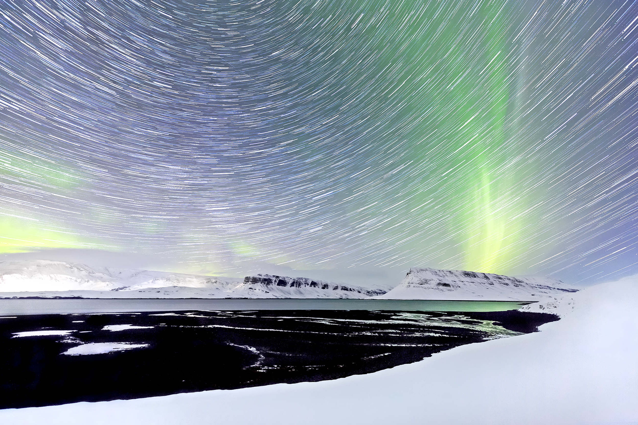
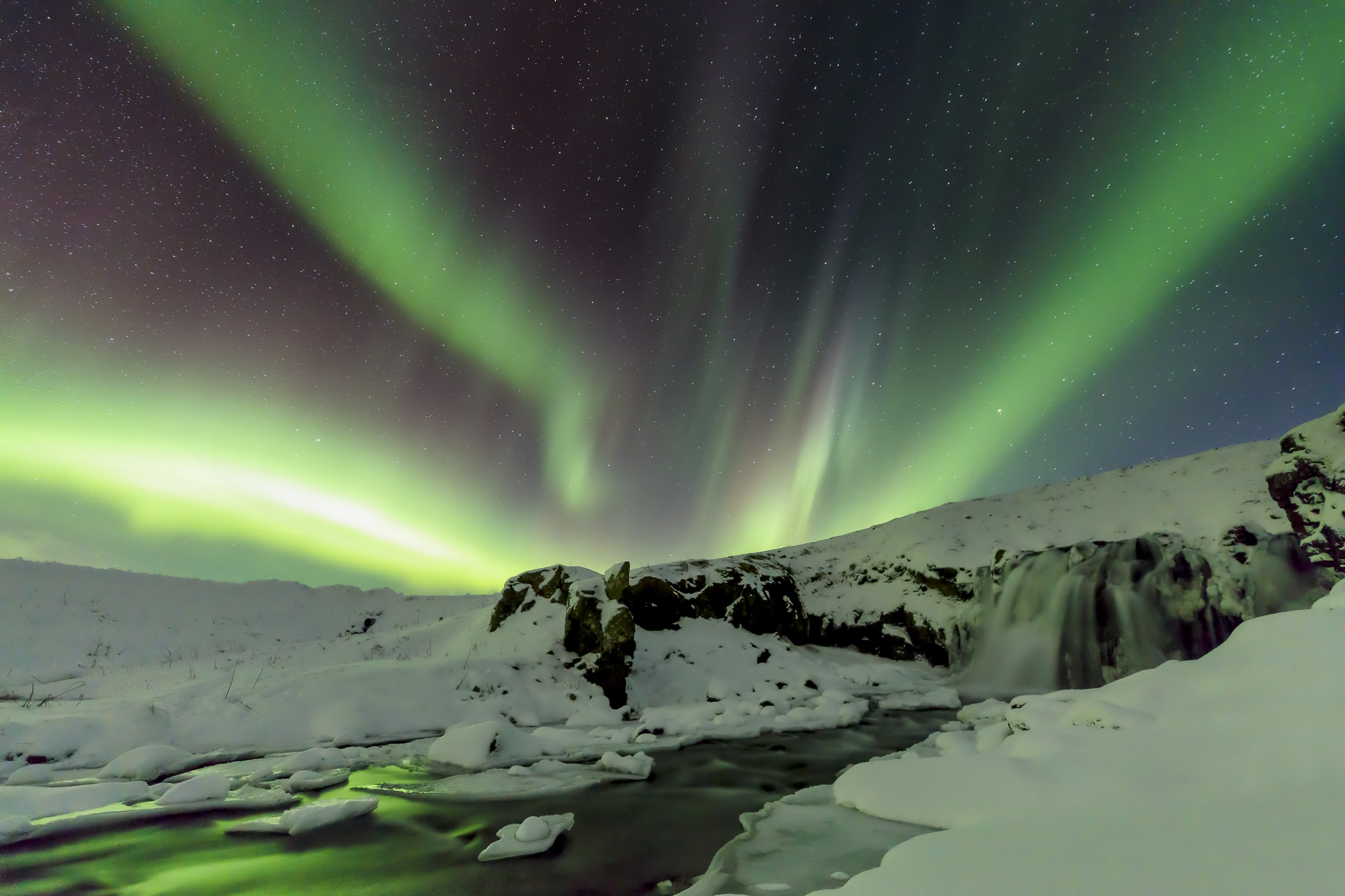
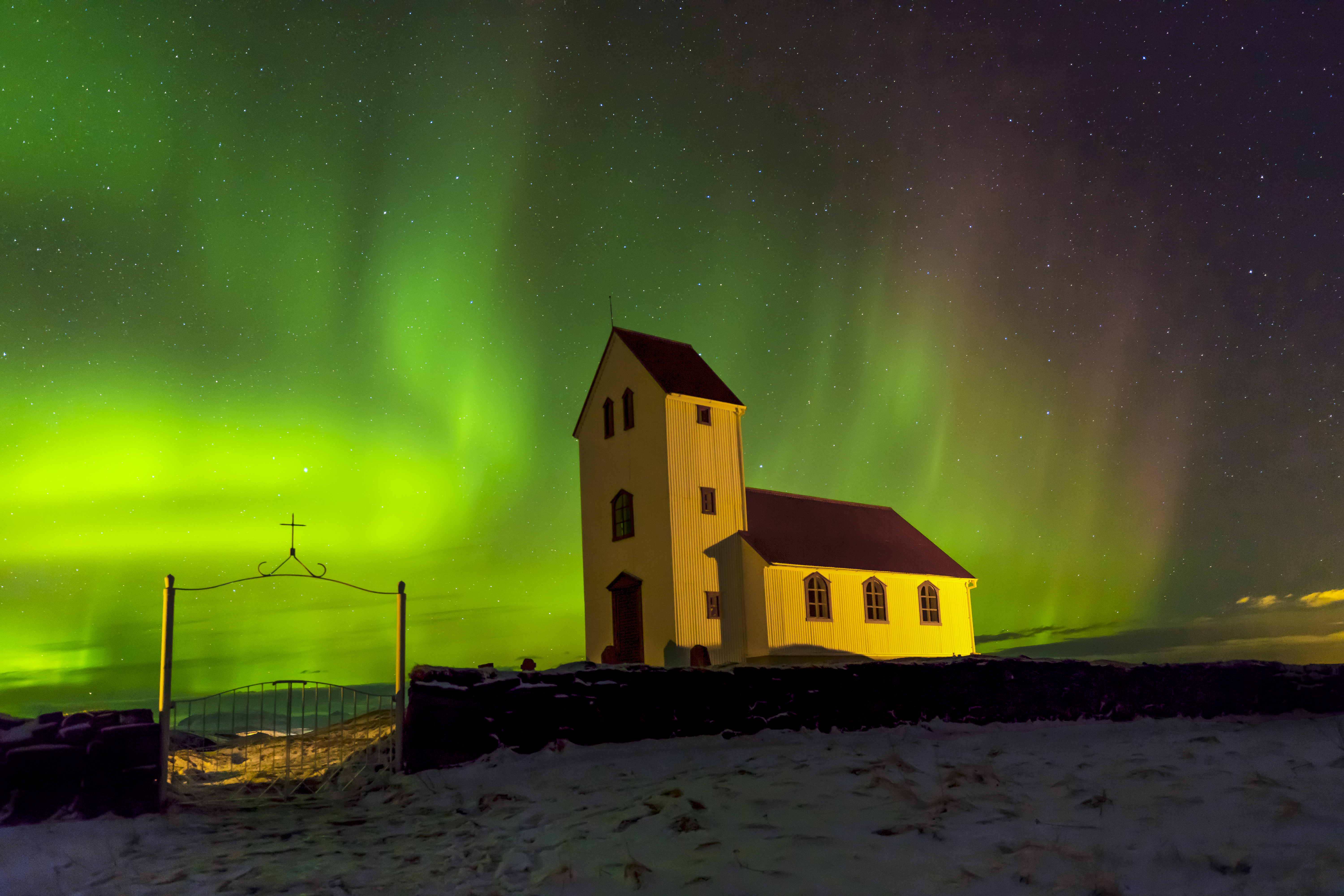
Awe: Aurora drama—ideal as a statement piece.
Energy: Golden aspens—pairs well with canvas or matte metal.

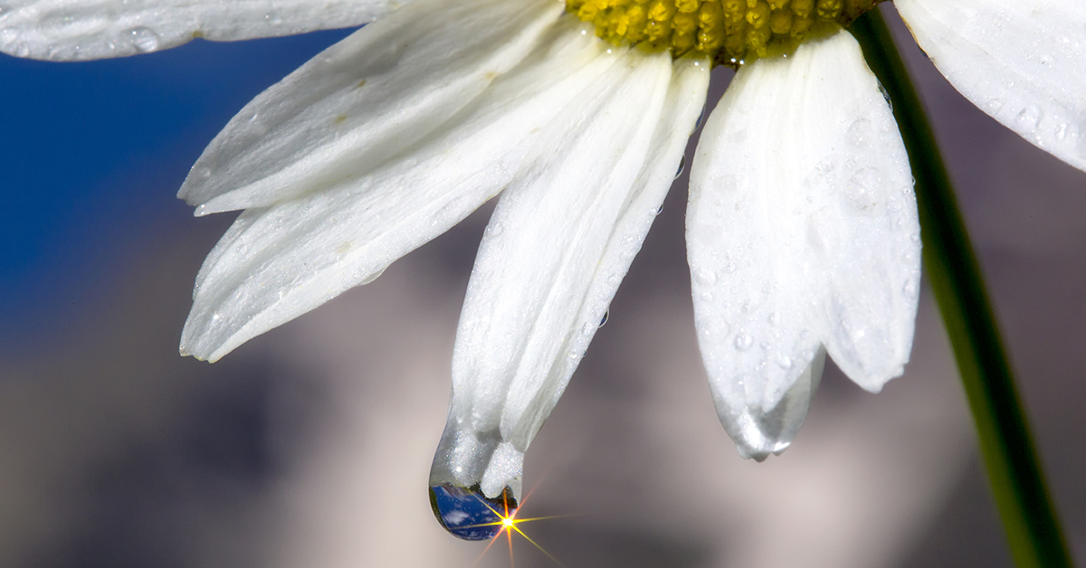
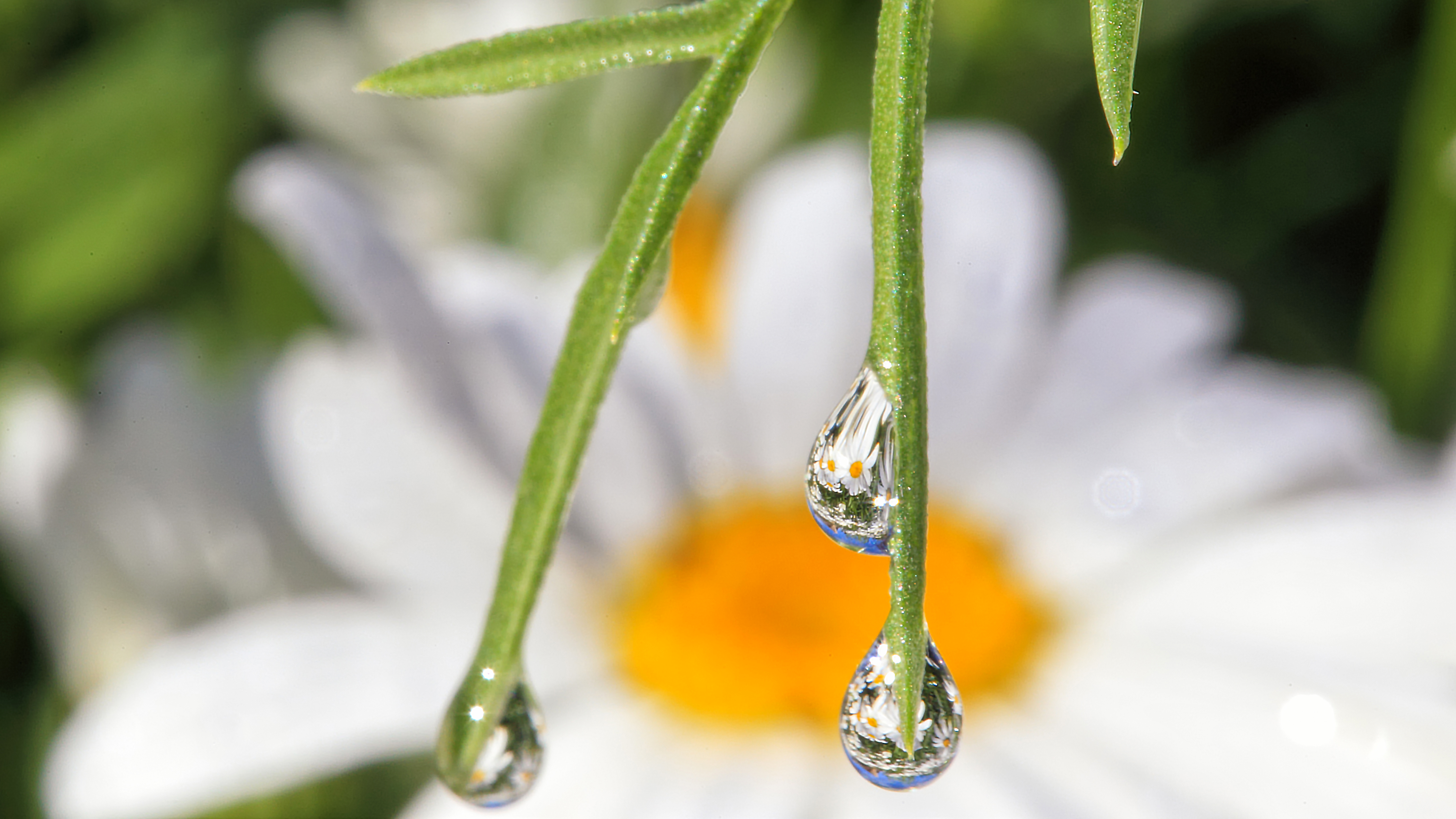
Stillness: Soft detail—made for giclée paper + mat.
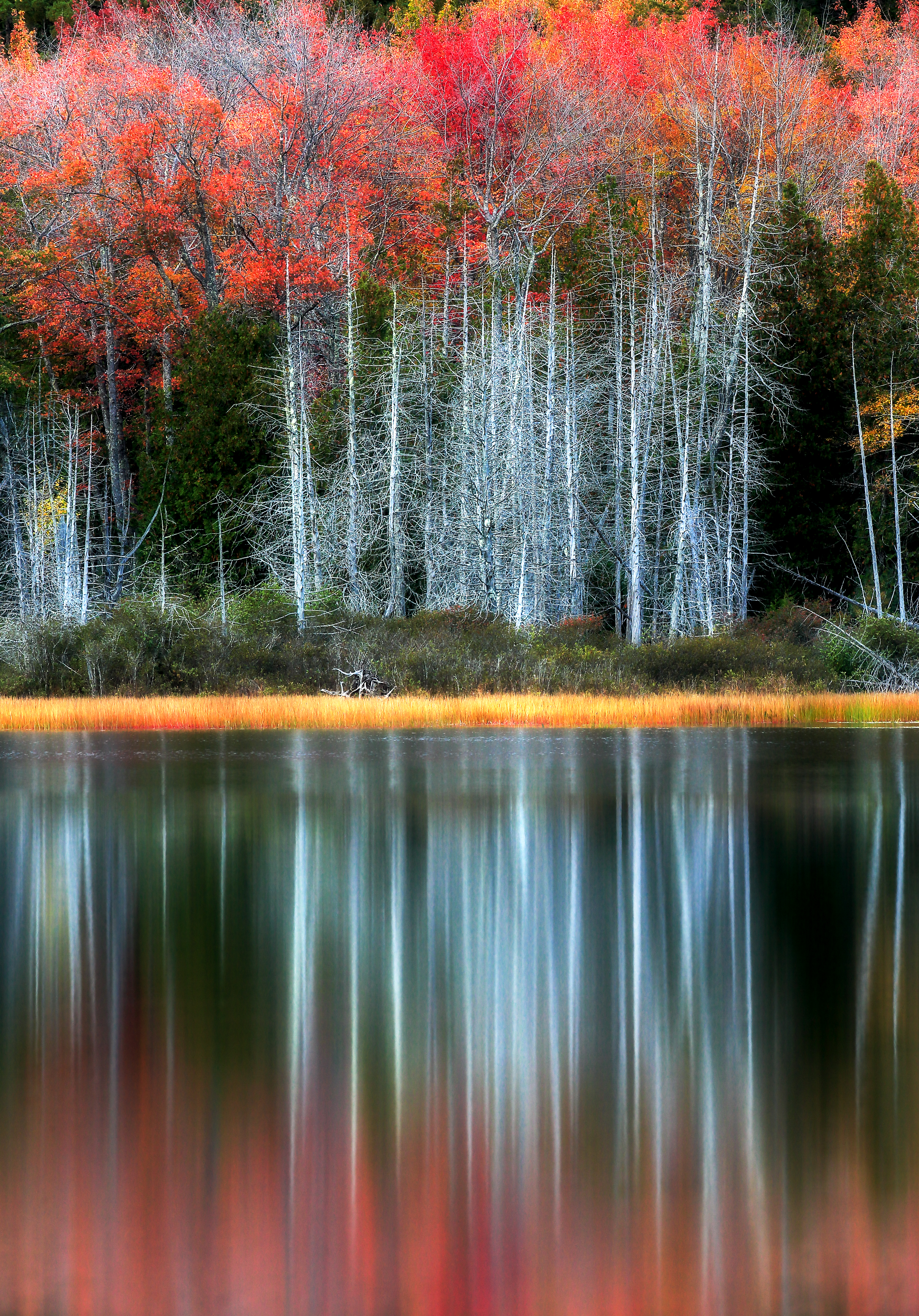
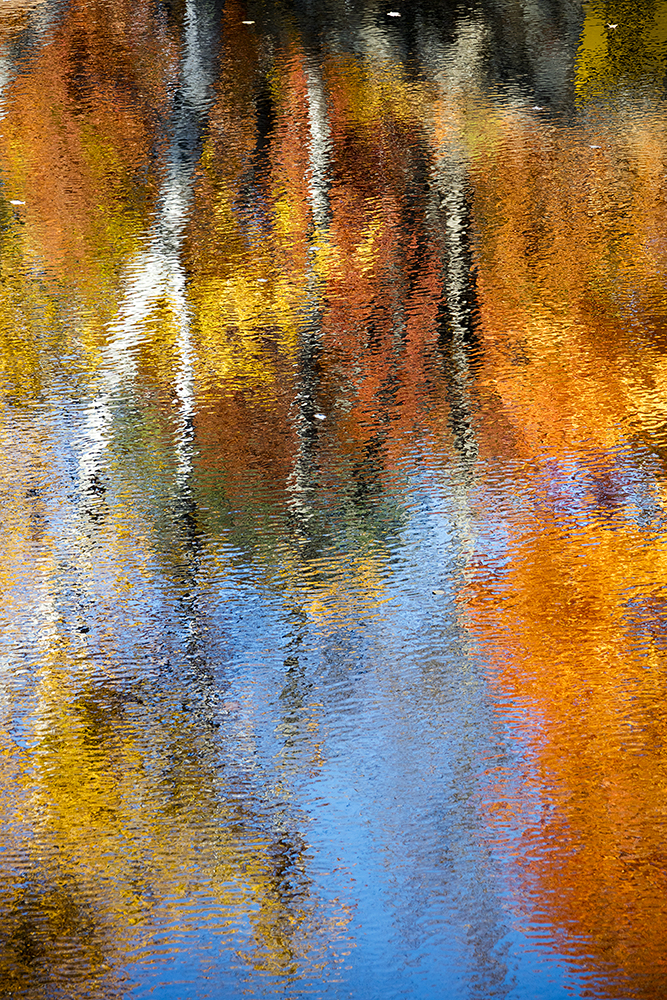
Calm: Reflective symmetry—great vertical for hallways.

Warmth: Sunset tones—choose sizes that echo furniture width.
Joy: Bright foliage—canvas or matte metal for sunlit rooms.
Keep spacing consistent (1.5–2 in) and align top edges for a clean, gallery-level install.
Bring the Wild Home
Explore curated collections—choose a category to start your wall.

Tip: For sunlit spaces, consider canvas or matte metal; for museum feel, choose giclée paper with UV/AR acrylic.

About the Author
Robbie George is a National Geographic nature photographer and fine-art storyteller. His work weaves fieldcraft with resonance—capturing the living pulse of wild places through light, geometry, and timing.
Beyond the maps you explored here, Robbie’s long-form series—Nature Code, The Living Code, and Quantum Agriculture—connect photography with rhythms of water, sunlight, and season. Each image and guide is an invitation to align awareness, breath, and field.
Frequently Asked Questions
1) What medium should I choose for bright rooms?
Go with canvas (matte) or metal (matte) to reduce reflections. Paper prints look beautiful too—just use UV/AR acrylic and aim lights around 30°. Compare finishes in Metal, Canvas, and Giclée Paper.
2) How high should I hang a print?
Center of artwork at roughly 57–60 in from the floor (average eye level). Above furniture, leave a 6–10 in gap and size the piece to about 60–75% of the furniture width. More tips: Framed Wall Art.
3) What sizes work best over a sofa or bed?
For a queen bed (60 in wide), a 36–45 in wide print feels balanced. Large living rooms can handle 30×45 or 40×60 statement pieces. See What Print Size Should I Choose?.
4) Will the colors fade over time?
Archival materials + proper lighting maintain beauty for decades. Avoid persistent direct sun and use UV-protective glazing for paper prints. See the Fine-Art Print Knowledge hub.
5) Can I group multiple smaller prints instead of one big piece?
Absolutely—use a grid, triptych, or salon wall with consistent spacing (1.5–2 in). Keep frames, tones, or subject matter consistent. Ideas: Triptych & Polytch Wall Art.